Logo Guidelines
A New Visual Identity
The FCPS Master Brand Mark
The Fairfax County Public Schools master brand mark (or logo) is the single most important identifier of the school system to students, parents, teachers, the county, and the entire region.
A new visual identity was created in 2016 to align with FCPS’ strategic messaging — representing a modern, forward-thinking school system that is focused on transforming the community through the children. The symbol of the book remains a primary element incorporating trustworthy blue brightened by yellow stars— signs of excellence and fulfilling one’s dream. Emerging from the book is the flame of knowledge, a symbol of enlightenment and learning. The positive visual identity conveys creativity, innovation, and success.
Policy on Creating Other Brand Marks
The creation of a new brand mark to designate a department, office, section, region, or specialty program is prohibited. No name or other branding element designed outside of the parameters identified in this manual will be endorsed or approved by Fairfax County Public Schools.
The implementation of FCPS’ new brand mark is budget-neutral. To be fiscally and environmentally responsible, the brand mark will be adopted offline through attrition. Please do not throw away any business cards, stationery, spirit wear, uniforms, signage, or other items that feature the existing brand mark. Incorporate the new logo only when ordering replacements or new items.
![]()
![]()
![]()
Usage
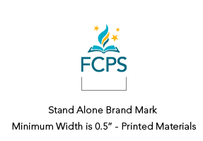
Minimum Size - Primary brand mark
To ensure maximum readability and recognition of the FCPS brand mark (logo) in printed materials, the brand mark must be a minimum width of 1.”
To ensure that the brand mark is legible online, it must be a minimum width of 120 pixels.
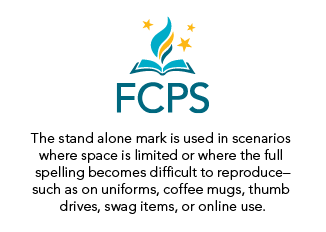
Printing restrictions sometimes require the brand mark to be very small. If this restriction means the logo will be smaller then the minimum width, then the stand alone mark should be used.


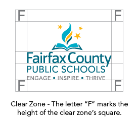
Clear Zone
The specified area of empty space surrounding a brand mark is referred to as the “clear zone.” This space ensures proper visibility of the brand mark and should remain free from any artwork, typography, or background color. The clear zone depends on the size of the brand mark. To determine the clear zone, measure the height of the type block, “Fairfax County.”